Unearthing the Echoes of Time: Sales Trend Analysis with timetk

Let’s journey together to an archaeological dig site. Picture the vast, open skies above, with clouds drifting lazily across the brilliant expanse. The wind whispers softly, gently rustling the sparse vegetation clinging to the dry, cracked soil. All around, there’s a sense of profound stillness, a quiet that speaks of centuries of history lying undiscovered just beneath our feet. But our excavation site is a unique one. We’re not looking for ancient pottery shards or centuries-old relics. Instead, our quarry is far more elusive: we’re after insights, stories, and patterns buried in the sands of sales data.
Our key tool in this expedition? The timetk package in R. Much like the soft-bristled brush in an archaeologist’s hand, which delicately teases out the secrets of the past from the earth, timetk helps us gently dust off the layers obscuring the treasures within our data.
Laying Out the Excavation Grid: Understanding Time Series Data
When archaeologists first arrive at a dig site, they don’t simply start digging indiscriminately. Instead, they carefully lay out an excavation grid to guide their explorations. Each square in the grid contains a wealth of information, a little slice of history waiting to be discovered. Similarly, before we dive headfirst into our sales data, we need to understand the lay of our ‘land’: time series data.
Time series data is a chronological record, a diary of sorts. It’s a detailed account of your sales, meticulously marked by the unceasing tick-tock of the clock. Each data point in your series is a unique layer of sediment, a stratum that carries a specific piece of the larger story. The ebb and flow, the rise and fall of these points create a rhythm, an undulating terrain that we are about to traverse.
Recognizing the patterns in this rhythm is our goal, but it can feel as daunting as deciphering the tales hidden within the countless layers of an archaeological site. Yet, with timetk as our compass and guide, this task becomes significantly less intimidating.
For this expedition, we’re working with the AirPassengers dataset, a classic time series dataset that documents the monthly totals of international airline passengers from 1949 to 1960. This dataset serves as our ‘dig site’ for this journey. By visualizing it, we get a bird’s-eye view of our site, revealing the contours and patterns that will guide our further explorations.
Digging Up Artifacts: Converting Dates with timetk
Unearthing artifacts from the annals of time is a fascinating process. Just as archaeologists take time to carefully decipher the markings and symbols on these remnants of history, we must treat our sales data with the same level of attentiveness. Each data point is like a newly discovered artifact. Its timestamp is the cryptic inscription that needs to be interpreted to understand the artifact’s origins and its place in history.
Date conversion in our dataset is akin to interpreting these inscriptions. A crucial step, as a misinterpreted date could lead to a misplaced artifact in the wrong era, leading to skewed results in the archaeological study. Similarly, mishandling date conversions in our dataset could lead us astray in our sales analysis. Fortunately, timetk has a set of tools designed to handle these date conversions in our time series data accurately.
# Load the necessary libraries
library(dplyr)
library(timetk)
library(lubridate)

# Load built-in dataset ‘AirPassengers’
data("AirPassengers")

airpass <- AirPassengers %>%
 tk_tbl(preserve_index = TRUE, rename_index = "date") %>%
 mutate(date = my(date))

head(airpass)
# A tibble: 6 × 2
#   date       value
#   <date>     <dbl>
# 1 1949-01-01   112
# 2 1949-02-01   118
# 3 1949-03-01   132
# 4 1949-04-01   129
# 5 1949-05-01   121
# 6 1949-06-01   135
In this code snippet, we’re using the tk_tbl() function from timetk to convert our AirPassengers data into a tibble and preserve the time index. Then, we use the mutate() and my() functions from the lubridate package to convert our date index into a proper Date object. This conversion paves the way for us to carry out more advanced time series analysis.
Carbon Dating: Period Calculations in Sales Data
In archaeology, carbon dating is a crucial tool to estimate the age of organic material found at the dig site. By determining the levels of carbon-14, a radioactive isotope, within an artifact, archaeologists can gauge when the object was last interacting with the biosphere. In our data excavation, we also have a similar process — period calculations.
Period calculations help us identify patterns in our sales data that recur over regular intervals. Much like carbon dating helps place an artifact within a specific era, period calculations assist us in contextualizing our sales data within its temporal framework. Whether it’s a seasonal fluctuation or a weekly cycle, recognizing these patterns can provide valuable insights into sales trends.
The timetk package offers a suite of functions to help us perform these period calculations smoothly. One such function is tk_augment_timeseries_signature(), which can generate a wealth of information about the temporal patterns in our data.
airpass_augmented <- airpass %>%
 tk_augment_timeseries_signature()

t(head(airpass_augmented, 3))

#           [,1]         [,2]         [,3]
# date      "1949-01-01" "1949-02-01" "1949-03-01"
# value     "112"        "118"        "132"
# index.num "-662688000" "-660009600" "-657590400"
# diff      NA           "2678400"    "2419200"
# year      "1949"       "1949"       "1949"
# year.iso  "1948"       "1949"       "1949"
# half      "1"          "1"          "1"
# quarter   "1"          "1"          "1"
# month     "1"          "2"          "3"
# month.xts "0"          "1"          "2"
# month.lbl "January"    "February"   "March"
# day       "1"          "1"          "1"
# hour      "0"          "0"          "0"
# minute    "0"          "0"          "0"
# second    "0"          "0"          "0"
# hour12    "0"          "0"          "0"
# am.pm     "1"          "1"          "1"
# wday      "7"          "3"          "3"
# wday.xts  "6"          "2"          "2"
# wday.lbl  "Saturday"   "Tuesday"    "Tuesday"
# mday      "1"          "1"          "1"
# qday      " 1"         "32"         "60"
# yday      " 1"         "32"         "60"
# mweek     "0"          "1"          "1"
# week      "1"          "5"          "9"
# week.iso  "53"         " 5"         " 9"
# week2     "1"          "1"          "1"
# week3     "1"          "2"          "0"
# week4     "1"          "1"          "1"
# mday7     "1"          "1"          "1"
The tk_augment_timeseries_signature() function adds several new columns to our dataset, each revealing a different aspect of the time-based patterns in our data. Columns like month.lbl, year’s half, and day of a year can be incredibly useful in uncovering trends and cycles in our sales data. Like an archaeologist piecing together shards of pottery to understand its original form, we can use these insights to assemble a more complete picture of our sales landscape.
Reading the Stratigraphy: Time Series Decomposition
Every archaeological site tells a layered story through its stratigraphy. Each layer, deposited over centuries, provides a distinct slice of history. It’s a chronological narrative waiting to be read, with chapters of environmental changes, human activity, and periods of stagnation or rapid growth. Similarly, our sales data too has a layered narrative. The process to read it is known as time series decomposition.
Time series decomposition peels back the layers of our sales data, allowing us to analyze distinct components like the underlying trend, cyclical patterns, and residual randomness. This step, much like an archaeologist mapping the stratigraphy of a site, reveals the broader patterns and forces shaping the sales landscape.
Let’s break down the strata of our sales data using timetk and forecast packages.
# Time series decomposition using mstl()
library(forecast)

decomposed <- airpass$Passengers %>%
 tk_ts(start = year(min(airpass$date)), frequency = 12) %>%
 mstl()

autoplot(decomposed)
Here, we use the mstl() function from the forecast package to decompose our sales data into its trend, seasonal, and random components. This is akin to an archaeologist separating and cataloging artifacts from different eras unearthed from each layer at a dig site.
But our exploration doesn’t stop here. Just as an archaeologist uses different tools to extract more details from each layer, we use the plot_seasonal_diagnostics() and plot_stl_diagnostics() functions to dig deeper into the seasonal and trend components.
# Plot seasonal diagnostics
plot_seasonal_diagnostics(airpass, .date_var = date, .value = value, .interactive = F)
# Plot STL diagnostics
plot_stl_diagnostics(airpass, .date_var = date, .value = value, .interactive = F)
These functions provide a more detailed visual inspection of the trend and seasonal components. By examining these, we uncover the unique “seasonalities” or recurrent patterns in our sales data, giving us greater insight into the forces driving our sales.
Restoring the Artifact: Communicating Insights from Our Sales Data
Archaeologists don’t just dig up artifacts and let them gather dust in a lab. They interpret, explain, and showcase their findings for others to understand the past and its relevance to the present. Similarly, as data scientists, we must communicate our insights effectively to others within our organization to ensure that our analyses have a tangible impact on business decisions.
Having cleaned, examined, and understood our data — our valuable artifact — we’re now ready to communicate our findings to the wider team. We’ve unraveled the trend and seasonal components, essentially the ‘history’, of our sales data. But how do we present these insights in a way that’s easily digestible and impactful?
In R, the ggplot2 package provides excellent tools for visualizing data, and it works seamlessly with timetk. Let’s create a simple line graph to showcase the trend in our sales data.
# Visualizing the sales data
ggplot(airpass, aes(x = date, y = Passengers)) +
   geom_line(color = "blue") +
   labs(title = "Sales Over Time",
         x = "Time",
         y = "Sales",
         caption = "Data source: AirPassengers") +
   theme_minimal()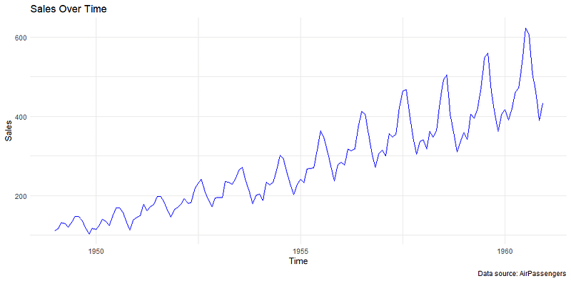
This line graph gives us a visual representation of our sales trend over time. We can clearly see patterns of rise and fall, much like the way an archaeologist can visualize the rise and fall of ancient civilizations from the artifacts they’ve unearthed.
Remember, communication is as essential in data science as in archaeology. We must narrate the story our data tells us — our findings, their implications, and their potential impact on future strategies. Just as an archaeologist would curate an exhibition to showcase their findings, we should present our data insights in an easily understandable and engaging way.
Conclusion
As we conclude our excavation of sales data with timetk, much like archaeologists wrapping up an initial dig, we’re not merely leaving with a pile of unearthed artifacts, but a chronicle, a tale told by numbers that delineates the ebb and flow of our business.
We commenced our expedition by setting up our excavation site, readying our dataset with timetk, akin to an archaeologist preparing their field of exploration. We plotted the trajectory of our sales, uncovering the macroscopic trends at play.
We dug further, much like an archaeologist sifting through strata, and decomposed our time series data, separating the overarching trends, seasonal variations, and random fluctuations. Using the tools mstl() and plot_seasonal_diagnostics(), we unearthed recurring seasonal sales patterns, shining a light on cycles previously obscured by the sands of time.
In the tradition of every good archaeologist, we didn’t keep our findings to ourselves. We presented them in a clear and digestible way using the ggplot2 package. Like an archaeologist showcasing their discoveries in a museum, we displayed our insights on a graph, narrating the story of our sales data through a visual medium.
In this entire process, timetk has been our trusted excavation toolkit, helping us delve into the mysteries of our sales data with precision and ease.
However, our exploration is far from finished. With the groundwork laid and the past understood, we stand on the brink of an exciting new phase. We are now ready to undertake the grand task of predicting the future from the patterns of the past.
In the forthcoming articles, we will dive into the world of feature engineering with timetk, akin to an archaeologist studying their finds to derive further insights. Following that, we’ll step into the realm of forecasting with timetk and modeltime, using our newfound knowledge to anticipate future sales trends and inform business strategy.
So, keep your explorer’s spirit alive as we dig deeper into the sands of time with timetk, deciphering the past, understanding the present, and predicting the future of our sales. As any archaeologist would attest, the real treasure lies not in the artifact but in the knowledge it imparts.
Stay tuned as we continue this thrilling journey into the heart of our sales data!